Brand Strategy
Your craft beverage has 3 seconds on shelf. Most craft brands lose that window before anyone opens a bottle. This is the framework that fixes it.
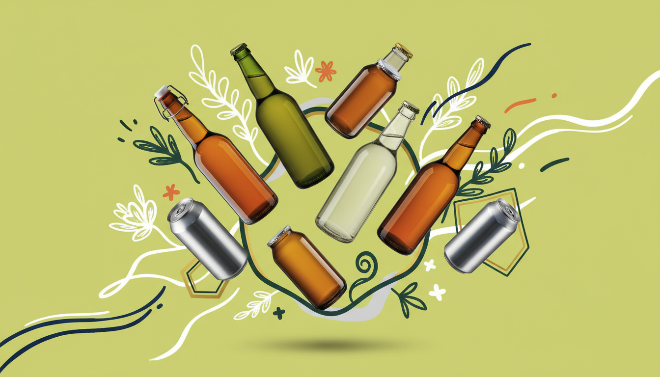
Craft beverage branding is the strategic and visual system that tells consumers who you are, why you're different, and why they should pick you up - all within the time it takes them to walk past a shelf display.
It's four connected decisions, not one design project. Most craft brands treat these as sequential steps and end up with beautiful design that doesn't differentiate, brand identity that cracks under SKU load, and packaging that gets lost in the cooler.
The specific territory your brand owns
The visual system that owns shelf space
The structure that scales as SKUs multiply
The tactics that win the 3-second test
Key Takeaway
Not "craft." Not "small-batch." Not "locally-made." Every brand on that shelf is claiming those. The generic artisan vocabulary is so saturated it's become invisible.
Own a micro-category. "Hop water" is more defensible than "sparkling water." "Mushroom coffee" carves territory that "coffee alternative" doesn't. Recess launched "CBD sparkling water for stress relief" and owned that position before anyone else had a name for it.
Jones Soda built its entire brand on community participation: photographer-submitted labels, consumer-driven product decisions. That narrative held together across 6+ product lines and decades of evolution because it was architecturally sound.
Liquid Death didn't compete on water quality. It competed on a war against plastic - and built one of the most recognizable beverage brands in the country from that single position.
Appalachian wildflower honey, Pacific Northwest hops, Texas mineral water - provenance is a story that mass-market brands structurally cannot tell.
Visual identity for a craft beverage brand has one job: communicate who you are from 6 feet away, earn a closer look from 2 feet, and reward that look from 6 inches. Most craft beverage visual identity fails the 6-foot test.
The instinct to use earthy, "craft-coded" tones is exactly wrong. Everyone else already had that instinct.
Bold, unexpected color combinations differentiate against the brown-and-green craft aesthetic. Snow Monkey earned gold and silver design awards partly through a deliberate color strategy - high contrast combinations that pop in a cooler full of competing cans.
Creates visual IP that's yours - not a stock-adjacent aesthetic three other brands already use. Jones Soda's photographer-submitted labels are brand IP no competitor can replicate.
Legibility from 6 feet is non-negotiable. Test every typeface at actual scale before committing. Decorative fonts that look beautiful in a design file become unreadable at shelf distance.
A strong visual pattern creates recognition beyond the logo. Recess's wavy pattern is immediately identifiable on a shelf of 40 products - before you see the name.
You launch with one SKU. Six months later, you need six. Without a system, each new SKU becomes its own design project and your shelf set starts to look like five different brands from the same distributor.
The fix is a three-tier visual hierarchy built before the second SKU:
Logo, primary brand color, core typography. These never change across any SKU, any format, any market.
Secondary color system, line-specific pattern. Consistent within a product line, distinct from other lines.
Flavor color, flavor illustration, flavor name treatment. The only elements that change per SKU.
Jones Soda executed this across 6+ product lines - mini cans, barrel formats, Pop Jones, Mary Jones - while maintaining brand coherence across a decade of product evolution. Snow Monkey launched with the system in place, which is how you earn design awards in year one.
An unexpected bottle or can shape earns attention before color or typography. Liquid Death's tallboy can is recognizable from across a convenience store - before you read the name.
What do six units look like together? Recess's wavy pattern creates visual rhythm when stacked - the blocked shelf set reads as a design element, not just a product cluster.
Most craft beverage packaging is busy. Deliberate negative space makes you stand out precisely because your neighbors are fighting visual noise with more visual noise.
Matte versus gloss, textured labels, metallic inks - tactile differentiation starts before the consumer reaches for the product. Topo Chico's embossed glass bottle signals premium quality through feel, not just visuals.
The Two Tests Before Production
The cooler test: Does your design hold up when the can is wet and cold? Does it pop in a field of ice?
The social test: Does it photograph well for Instagram and TikTok? Earned consumer photos are media you can't buy.
Snow Monkey launched into a crowded functional beverage category competing against established brands with national distribution. The challenge wasn't product quality. It was market position.
Plant-based indulgence - not "healthy smoothie." The positioning found the specific territory the brand could own against competitors defaulting to generic health claims.
Bold color blocking that broke from the green-and-brown default. High contrast, unexpected palette that pops in a cooler full of competing cans.
A flavor color system designed to scale across 6+ SKUs from day one - each flavor distinct, all unmistakably Snow Monkey.
Gold and silver RTD design awards within the first year of launch. Recognition that drove retail conversations independent of advertising.
AVO Brands builds beverage brand systems that survive the 3-second test - with proof from Snow Monkey, Jones Soda, and 15+ years of CPG packaging work.
Work with AVO Brands