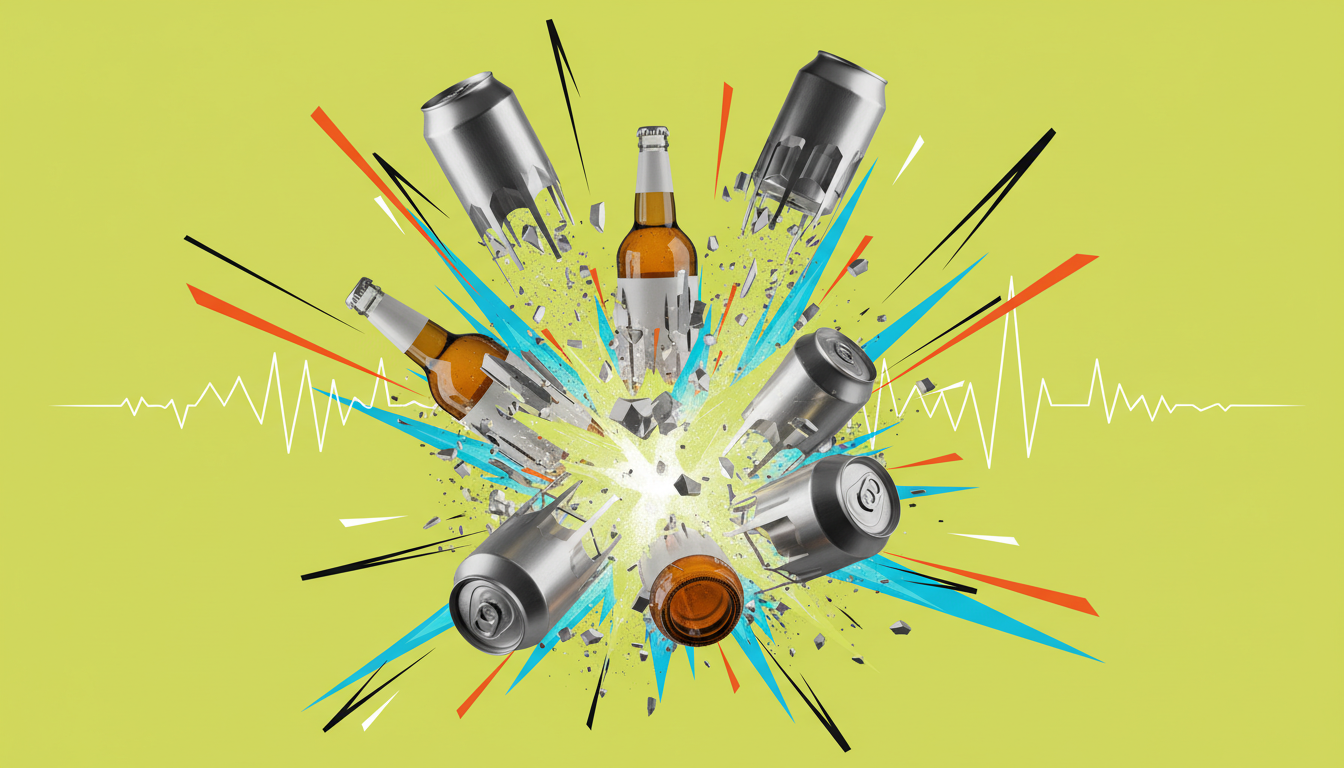
CPG Packaging
Trends in beverage packaging don't emerge from design studios - they emerge from shelves. The 2026 beverage packaging trends that matter are the ones that produce shelf conversion, not the ones that win design awards in isolation.
Snow Monkey's RTD packaging earned gold and silver awards in its first year of launch - not because the design was trendy, but because it was built to stand out in a specific retail environment against specific competitors. That's the difference between trend adoption and strategic packaging design.
Five Trends, One Standard
Each of these trends produces results when it serves a specific brand strategy - and fails when it's chased for its own sake. Build from the brief, not the trend deck.
Over 60% of beverage consumers actively prefer sustainable packaging options - and retail buyers at Whole Foods, Target, and natural grocery chains factor sustainability into new vendor selection. The 2026 shift: brands are moving from sustainability as a marketing claim to sustainability as a material decision made before design begins.
The strongest sustainability story in beverage packaging. 75% of all aluminum ever produced is still in use. Infinitely recyclable without quality degradation. Serves both the sustainability story and premium shelf positioning simultaneously.
Premium and recyclable. Communicates quality through transparency, weight, and tactile experience. The trade-off: weight increases shipping costs and breakage risk matters in transit.
The sustainability trend with the best economics. Removing secondary packaging, reducing label weight, using thinner walls reduces carbon footprint 20–40% per unit and often reduces production cost. The design challenge: making reduction look intentional rather than cheap.
The pendulum in beverage packaging has swung away from busy, decorated labels toward bold, simple color expressions. The trend is not minimalism for its own sake - it's recognition that a single strong color makes more shelf impact than a complex design.
Snow Monkey's RTD packaging succeeded in part because the color strategy deliberately broke from the green-and-brown functional beverage default. Jones Soda's evolution across product lines demonstrates the same principle at multi-SKU scale: a bold, consistent visual system that maintains brand coherence across 20+ SKUs without adding visual complexity.
Design Discipline Required
Minimalism is harder than decoration. Removing elements until only what's essential remains - and making that essential set do all the shelf work - requires more creative precision than adding visual information.
The functional beverage category is growing across RTD coffee, hydration drinks, adaptogens, nootropics, and protein-forward beverages. These products are consumed on the go. The packaging needs to work in motion.
Consumers in functional beverage categories are often multi-sip consumers. Resealable caps and push-pull lids have become table stakes in categories where the use occasion extends beyond a single sitting.
A standard 12oz slim can fits standard cup holders. A 16oz tall boy doesn't. A custom-shaped bottle may not. Before committing to any structural format, test it in actual use contexts - vehicle cup holders, gym bag side pockets, desk cup holders.
The same brand across multiple sizes serves different consumption contexts. A 8oz can for a single shot, 12oz for a moderate serving, 16oz for the extended workout. Size diversity reaches more occasions without format-specific brand redesigns.
The consumer who stops in front of a beverage they haven't tried before is making a purchase decision in under 30 seconds. The trend in 2026: brands are moving storytelling from the back label to the front label. Key narrative elements visible from 2 feet.
Where the ingredients came from, who grew them, what makes the source specific. Functional ingredient brands with specific sourcing stories are building market positions around provenance the way wine regions built theirs.
"What's actually in this?" is increasingly the first question sophisticated consumers ask. Brands that lead with ingredient specificity convert the transparency-seeking consumer more effectively than vague "natural ingredients" claims.
40 Tons carries the weight of its justice reform mission in its visual vocabulary - the imagery, the name, the symbolism - before the consumer reads a word of explanation. That's mission as architecture, not mission as caption.
When everyone has excellent label design, the packaging structure itself becomes the differentiator. Shape, material, format - these communicate before the label is read.
The slim can (12oz, slender profile) has become the premium RTD beverage format across cold brew, hard seltzer, and functional categories. It photographs well, fits in cup holders, and reads as a contemporary format choice.
A bottle shape specific to the brand is the highest-impact structural differentiation available - and the most expensive. Custom tooling costs $20K–$100K+. For brands with sufficient volume, a distinctive shape is recognition that persists across retail contexts.
Matte finishes, embossed labels, textured paper label stocks - these create tactile differentiation that begins before the consumer reads the label. The tactile experience of picking up the product is part of the brand experience.
Cases, multi-pack carriers, display fixtures - the structural design extends into how the product looks on the shelf in bulk display. Brands that design for the shelf block earn secondary recognition that single-unit packaging doesn't capture.
AVO Brands builds beverage packaging designed to win on shelf - format decisions, color strategy, and production constraints all working together.
Work with AVO Brands